|
|
|
|
|
|
|
|
|
|
|
|
|
||
|
|
|
|
|||||||||||
|
|
|
||||||||||||
|
|
|||||||||||||
| Drawing the Ultimate Cell Phone - page 9 |
 |
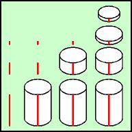
To create the antenna get the "An Isometric Evaluation Library" in your Symbol Roll-up and choose number 37 at 0.65 inches. Fill with white. Since this will be abuild up we must work from bottom to top. Zoom in and draw vertical lines of the following dimensions: 0.6", 0.22", 0.06". Align the lines horizontally but space them apart vertically. Turn on Snap to Objects and drag the cylinder symbol until the top center snaps to the 0.6" line. Use the node edit tool to marquee select and drag the bottom nodes down to the bottom of the line. Repeat the process for the 0.22 and 0.06 lines. Duplicate the 0.06" cylinder and reduce it 80 percent using the Transform Roll-up. Use the Node edit tool to correct the length to 0.06". |
 |
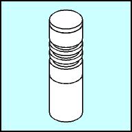
Delete the lines and set your preferences to 0.01. With
snap to objects turned on build up the antenna as follows, correcting
any front to back order as necessary: From bottom to top; 0.6" cylinder, snap 0.22 cylinder, 80 percent cylinder snap and nudge up 0.03", 0.06" cylinder snap and nudge down 0.02", Duplicate the last two cylinders and snap then nudge up 0.03" and bring to front twice, Duplicate the 0.22" cylinder and move up to snap it to the bottom of the top cylinder. Delete the shorter cylinder and bring the 0.22" to the front. Duplicate a 0.06" cylinder and snap it to the bottom of the top cylinder and bring to front. |

|
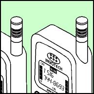
Position the antenna as shown. There are three nodes along the
bottom curve of the cylinder, delete the left two. With the Node edit
tool marquee select the remaining right node and the node to the right
and drag down about 0.375". |
Home,
About, Contact,
FAQ, Shop,
Products, Services,
Learn, Tips
and Tricks, Tools
© 1997 - 2001 John M. Morris